Hopen.Co is a dynamic fusion of architectural brilliance and interior design ingenuity. As an Architect + Interior Design company, we redefine spaces with a perfect blend of aesthetics, functionality, and innovation. Our commitment to excellence extends beyond conventional boundaries, creating environments that inspire and elevate. While we excel in architectural and interior design, our prowess extends to construction consultancy, offering a comprehensive suite of services that cater to every facet of your project.
Whether you're envisioning a cutting-edge architectural masterpiece, a captivating interior space, or seeking expert guidance in construction consultancy, Hopen.Co is your trusted partner. Join us in shaping a brighter future, where every space tells a story of innovation, inclusivity, and timeless design.
Whether you're envisioning a cutting-edge architectural masterpiece, a captivating interior space, or seeking expert guidance in construction consultancy, Hopen.Co is your trusted partner. Join us in shaping a brighter future, where every space tells a story of innovation, inclusivity, and timeless design.
"Hopen.Co - Open the Future Hopes"


Concept
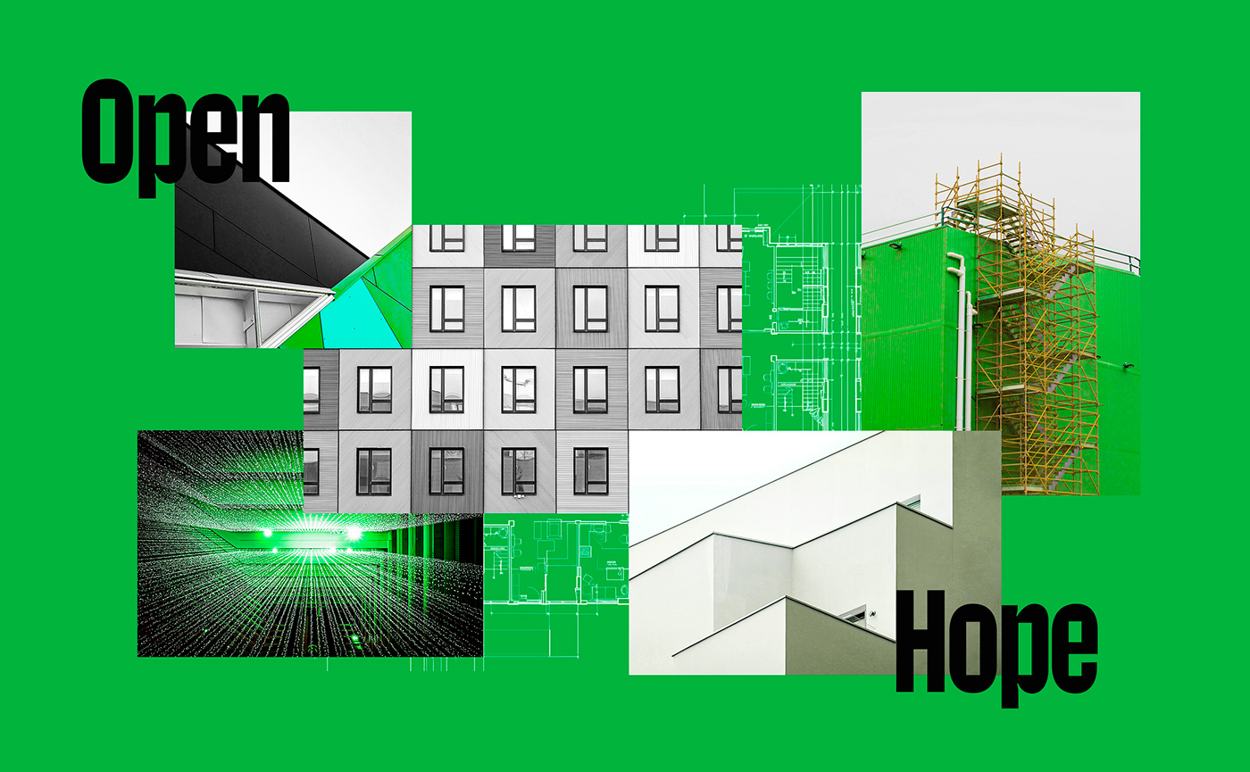
The design concept for the brand identity of Hopen.Co is a fusion of architectural design and sustainability, aiming to deliver a distinctive and authentic experience in the field of architecture. We apply architectural characteristics to build the brand identity, such as examining external/internal elements, heights, scaffolding, and unique angles/shapes of building structures. This helps clearly express the systematic and sustainable features of constructions, as well as the creative essence of the design company.
We also draw inspiration from the concepts of technology and nature to create a harmonious balance between technology and ecology. Technology brings new conveniences and efficient functions, while nature provides a healthy living environment, fostering human development and happiness. The design concept also emphasizes functionality, practicality, and uniqueness, asserting the resilience of Hopen.Co in the mission to rise above and surpass the limits of architectural design.


Brand Typeface
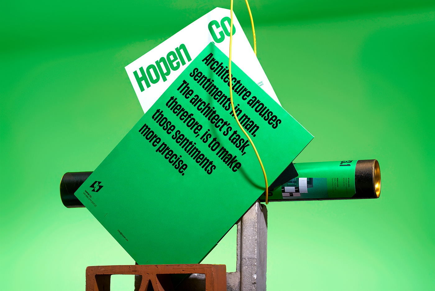
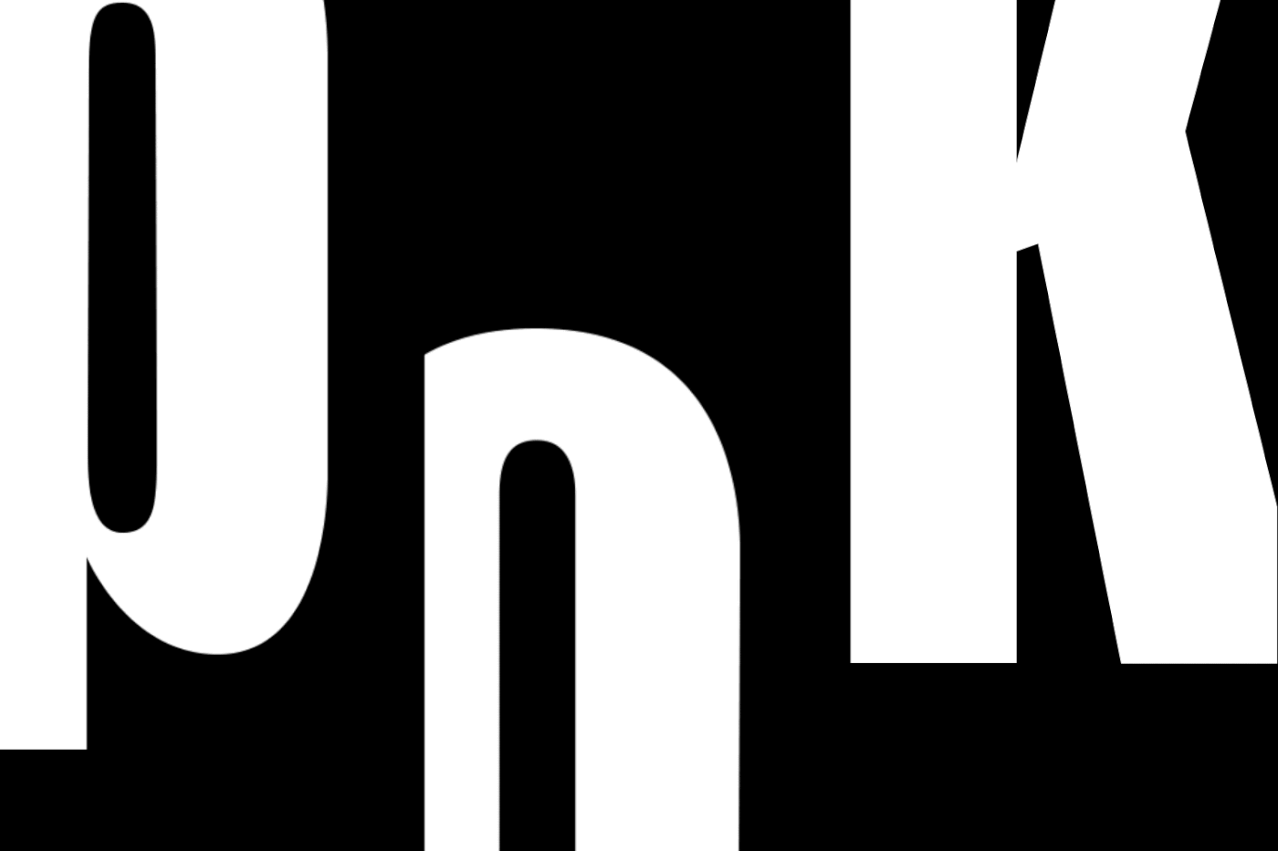
To fully embody the brand spirit of Hopen.Co, we have independently designed an exclusive typeface named Hopen Sans. This typeface has brought a distinctive language and identity to the brand by integrating architectural elements such as building height, structural shapes, layers of doors, and living spaces into each character.
The characters are designed in the Condensed style, emphasizing the height of closely positioned high-rise buildings, creating a sense of community. The negative spaces of letters are crafted as squares instead of circles, reminiscent of the structure of door layers within buildings, simultaneously enhancing the contrast with the outer curves of the characters. The inktrap details are meticulously crafted for each letter, reminding of the dedication and responsibility in the design and construction process of Hopen.Co.
Hopen Sans highlights the raw, straightforward nature of architectural structures, focusing more on functionality than unnecessary decorative details. This ensures legibility and recognizability in layout design and typography, creating an elegant and minimalist look that effectively conveys messages and enhances brand recognition.


Visualization
The logotype employs the Hopen Sans Brand Type, coupled with a logomark featuring the initial "H" from the brand name, designed in a three-dimensional structure to underscore the architectural concept. The minimalistic and powerful logotype plays a pivotal role in reminding customers of the brand name, creating a sense of familiarity and memorability. Simultaneously, the logomark offers flexibility in various cases and layouts, contributing to a modern and diverse brand identity system.
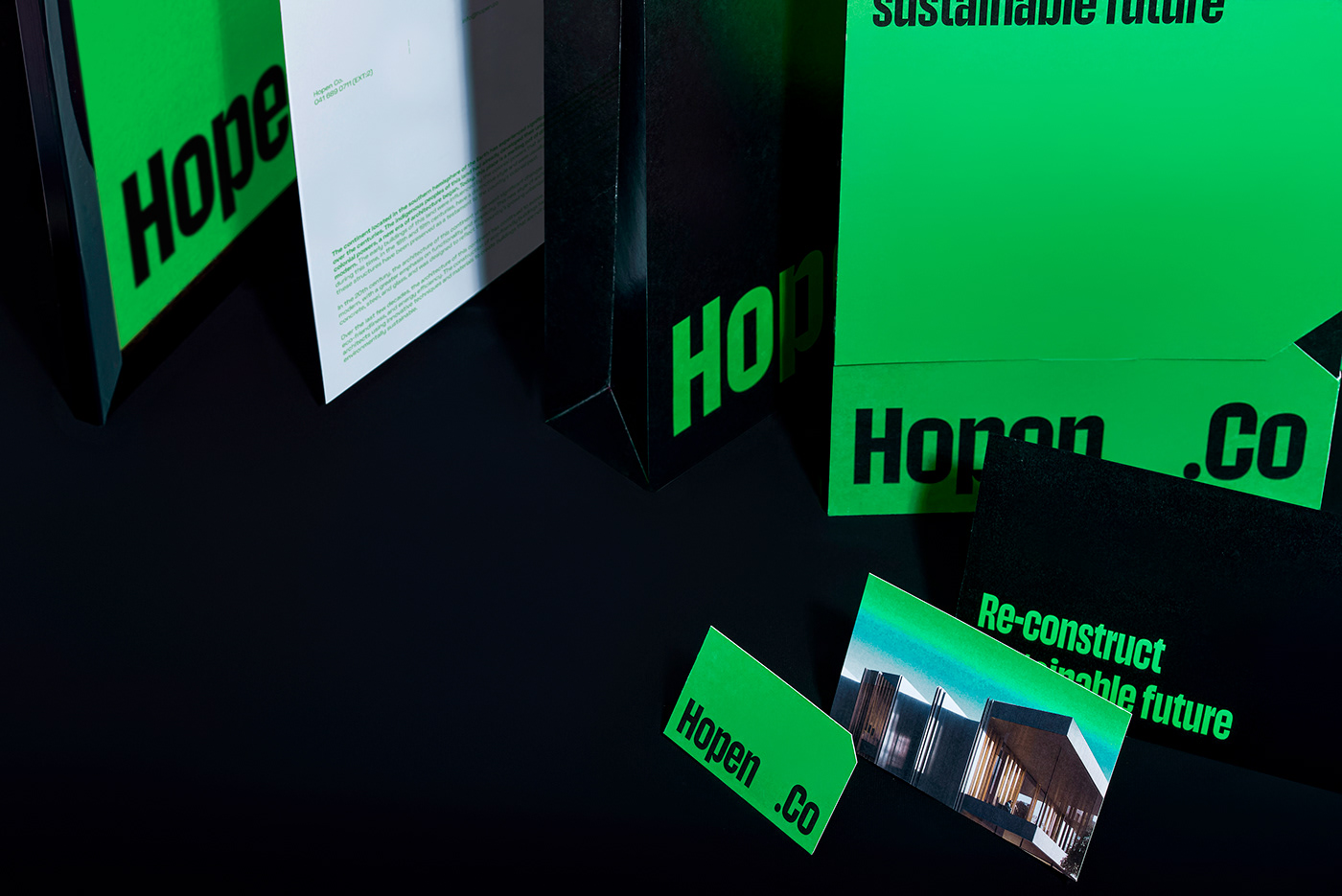
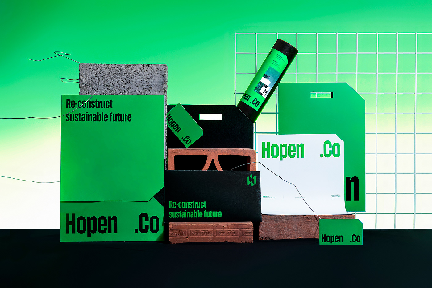
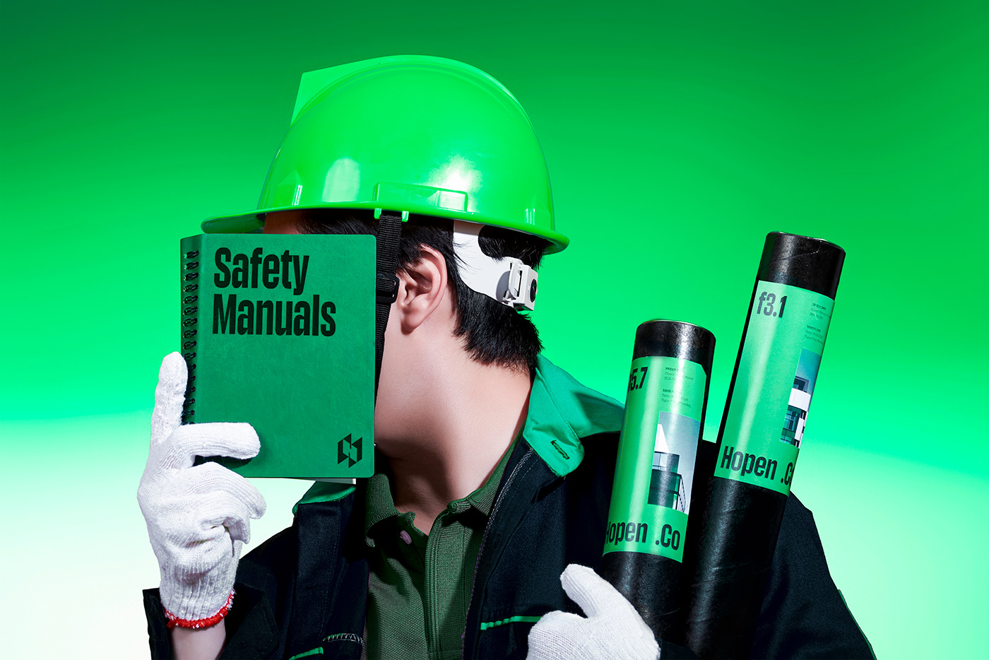
The contemporary green-black-gray color palette is bold, eye-catching, and sets the brand apart with its unique identity. The green hue symbolizes the convergence of technology and nature, aligning with the mission to craft a human-centric living environment. Meanwhile, the black and gray colors evoke elements of construction materials such as cement, mortar, sand, and steel, adding a touch of modernity and strength to the brand.


Key Visual System
Strokeline graphics intricately form a grid reminiscent of cage reinforcement and scaffolds, integrated inside applications like envelopes and shopping bags, subtly alluding to the core strength that contributes to sustainability. The design layout, featuring a robust column grid, evokes welded-wire reinforcement, with visual elements arranged in bottom-up baselines, creating a sense of floors and strong contrast for an architectural aesthetic.
The typography system maintains a clear left-to-right alignment, ensuring a concise and functional structure. Highlighted information is horizontally justified, with vertical bars (|) enhancing the visual narrative by creating a sense of architectural layers for improved message reception. Photos prominently showcase computer-rendered architectural designs, set in central, well-defined surroundings. The green gradient background behind these buildings harmonizes with the brand's color palette, sparking interest and unity.


Interactive Design
In the Hopen.Co brand identity, we integrate interactive elements into the design to enhance clear and engaging message delivery, while also highlighting the technological aspects employed by Hopen.Co. The upward motion effect is applied to letters, images, and graphics, creating a sense of construction, emphasizing the brand's aspiration for elevation.
Simultaneously, the diversity in design during interaction with people in various spaces, from the streets to offices, and across online media platforms, places a strong emphasis on the ability to create a rich and meticulous interactive experience from Hopen.Co. This goes beyond architectural design, extending to every aspect of user experience.


Credits
Creative Director: Alex Dang
Designer: Nhien Nguyen, Lam Lam, Vinh Nguyen
Designer: Nhien Nguyen, Lam Lam, Vinh Nguyen
Type Designer: Huy Le
Account Manager: Hang Nguyen
Print Producer: Hong Ha
Account Manager: Hang Nguyen
Print Producer: Hong Ha
Copywriter: Truc Pham
Photography: Quynh Nguyen, Khoa Ngo
Photography: Quynh Nguyen, Khoa Ngo
Thanks for watching. If you like our project, please appreciate below.


